Looking to refresh your space with stunning colour—but unsure where to start? This guide is here to help you navigate the world of the best interior design colours for Australian homes. Whether you’re painting a bedroom, renovating your living room or simply want to add a stylish accent wall, you’ll find the insight you need here. We’ll walk you through which tones are trending, how to pick the right shade for each room, and how to avoid those “what was I thinking?” colour disasters (we’ve all been there).
Snapshot Summary
Here’s what you’ll learn:
- Why colour matters: The right palette can transform how a space feels and functions.
- What’s trending in Australia: From warm neutrals to earthy tones, we’re seeing new directions in 2025. (Real Estate)
- Room-by-room strategy: Different functions call for different colours.
- Practical quick guide: Real-world example to help you pick colours and avoid mistakes.
- Interactive quiz: Check whether your space is ready for a colour revamp.
- FAQs: Because you’ll have questions (and we’ve got answers).
Want to dive deeper? Keep reading!
1. Why Colour Choices Make or Break a Space
- Colour influences mood, perception of space and even your daily energy levels.
- The right hue can expand a room, make it feel warmer or cooler, and highlight architectural features.
- In Australia, interior design is shifting away from cold greys and stark whites toward warmer, natural-inspired tones. For example: “Australian interiors are moving away from stark whites and greys in favour of warm, nature-inspired tones such as muted ochres, sandy beiges, sun-washed clay, olive greens and ocean blues.” (site.co-architecture.com)
- Bold statement: If you’re using the same colour throughout the whole house simply because “it’s safe”, you’re missing an opportunity to tailor each room’s vibe.
Did You Know?
Even when you think a colour looks great in a small swatch, once it’s on a full wall—and lit by Australian sunlight—it can change dramatically. Always test big before you commit.
2. The Colour Palette Trends Australians Are Embracing in 2025
Let’s explore what’s hot (and what’s fading) down under.
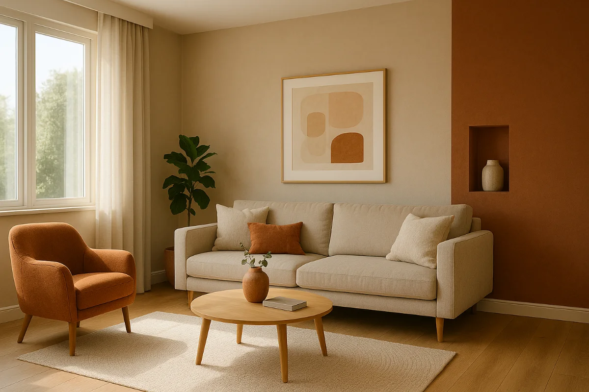
Warm Neutrals & Earthy Bases
- Shades like sandy beige, warm taupe, clay and soft ivory are becoming the new “safe” neutrals. They bring warmth, longevity and versatility. (Real Estate)
- Great for: living rooms, open plans, high-traffic areas where you want a timeless base.
Earth Shades & Natural Colour Stories
- Terracotta, olive green, muted moss, and deep browns bring texture and depth. They pair beautifully with timber, linen and stone. (Real Estate)
- Fun fact: Earth tones (greens, olive, browns) are called “earth tone” because they reflect natural materials and landscapes. (Wikipedia)
Rich Accent Colours & Mood Makers
- Deep blues, moody purples, wine reds are making a comeback for statement walls or rooms with personality. (baresque.com.au)
- Great for: study rooms, creative spaces, or feature walls where you want drama.
Colours Fading Out
- One-dimensional grey and very stark whites are losing favour—homes in Australia are being designed to feel warm, lived-in and inviting, not cold and bland. (Brisbane Times)
Pro Tip Box
If you’re on a budget but want a fresh start: pick a warm neutral for your base, then add coloured accents (cushions, art, one wall) in a richer tone. Two colours that speak together > three random colours.
3. Room-by-Room: Best Interior Colours for Every Room
Here’s how to tailor palette choices by room—because your lounge doesn’t need to be the same colour as your bathroom (unless you’re going for a specific style).
Living Room & Open Plan
- Base colour: Warm neutral (warm beige, soft taupe) for longevity and flexibility.
- Accent options: Earthy olive or terracotta for texture; deep blue for input of richness.
- Use continuation of flooring or furnishing tones to maintain flow in open plan spaces.
Kitchen & Dining
- Kitchens are where you can play with subtle colours (but avoid going too bold unless you love it). Warm neutrals + natural materials = safe and stylish.
- If you have strong cabinetry or main features, choose a quieter wall colour so things feel balanced.
Bedroom
- Aim for restful. Soothing greens, soft moss, muted terracotta or dusty rose. Avoid too-bright or harsh colours if you use the room for winding down.
- Accent wall: Maybe one side in a deeper tone (wine, forest green) while keeping other walls lighter.
Bathroom & Powder Room
- Because these are smaller spaces and often less lighting: darker textures can work. Moisture-resistant paints + rich accent tones = luxe feel.
- Consider colour in tiles or cabinetry (e.g., olive or slate) while keeping walls lighter for space.
Home Office or Creative Space
- For productivity + mood: deeper blues or moody purples can give gravitas, or brighter greens for freshness.
- Add accent colours that inspire you personally—remember personality matters!
4. Quick Guide: How to Choose Your Colour (and Avoid Regret)
Intro: Suppose you’re renovating your hallway and feel overwhelmed by paint charts. Let’s walk through how to pick colours that will work—and live happily ever after (or at least until your next makeover).
Common Challenges
- Are you worried: “Will this colour look good in our light?”
- Is your sample board saying 10 different things and you can’t settle?
- Concerned that you’ll pick something trendy that will feel dated in two years?
How to Solve It
- Pick your anchor tone first: Choose a base colour that will remain for years (warm neutral).
- Test in real light: Paint a patch, observe morning, midday and evening light to see how it shifts.
- Add accent strategically: Once your base is comfortable, pick one or two richer hues (terracotta, deep blue, wine) for feature walls or furnishings.
- Ensure cohesion across rooms: If your hallway flows into the lounge, choose related tones—not wildly different ones that clash.
Why It Works:
You get a home that feels unified, safe for the long term but still stylish. You’re not trapped in a fad—and you’ve got room to refresh with cushions or art rather than a full repaint next year.
If you’d like help narrowing down colour swatches or want a custom palette for your home, consider reaching out to a design pro.
5. Interactive Survey/Quiz: What’s Your Colour Personality?
Tick your answer and discover your colour mood!
- When you walk into your home after a long day, you want it to feel:
- a) Calm and grounding
- b) Bright and energising
- c) Rich and dramatic
- d) Crisp and minimalist
- Your ideal accent piece is:
- a) A terracotta pot with native plants
- b) A bold jewel-toned cushion
- c) A deep navy bookshelf
- d) A clear acrylic lamp and white ceramic décor
- The view from your main window shows:
- a) Garden or bushland
- b) Urban cityscape
- c) Water/ocean or long horizon
- d) Neat suburban street
Results:
- Mostly a’s → You’re a Warm Nature Seeker: lean into warm neutrals + earth tones.
- Mostly b’s → You’re a Bold Colour Explorer: go for richer accents, fun combos.
- Mostly c’s → You’re a Depth Enthusiast: deep blues, moody purples, luxury finishes work for you.
- Mostly d’s → You’re a Clean Minimalist: lighter neutrals, crisp contrasts, understated elegance.
6. FAQs
Q1: How do I know if a colour will suit my home’s lighting?
- Tip: Paint a large patch on the wall and observe at different times of day. Natural light, artificial light, shadow—it all impacts the final look.
- Note: In Australia, strong sunlight can shift tones more than you expect.
Q2: Are “best interior design colours” just trend-driven?
- No—they’re partly trend-driven, partly timeless. The smartest palettes combine enduring base tones (warm neutrals) with current accent trends (earthy greens, terracottas) so you don’t feel dated. (baresque.com.au)
Q3: If I’m selling my home, should I go safe?
- Yes — generally. Use warm neutrals for broad appeal, plus maybe one subtle accent wall to show flair without putting off potential buyers. Research shows neutrals remain strong in resale in Australia.
Q4: Can I use more than one accent colour?
- Absolutely—but be deliberate. Choose your anchor base colour, then select one or two complementing accent tones. Don’t go wild with five completely different colours unless you want a bohemian vibe.
Q5: What colours should I avoid right now?
- One-dimensional greys and stark whites are being replaced in Aussie interiors because they feel cold and impersonal. (Brisbane Times)
Conclusion
Choosing the best interior design colours isn’t about following every trend—it’s about understanding your space, your lighting, your lifestyle and then making a smart, confident decision. With warm neutrals as your foundation, and thoughtfully selected accent hues (earthy greens, terracottas, deep moody tones), you’ll create an Australian home that looks stylish now and endures for years. Time to reel in that paintbrush, test those swatches—and enjoy the transformation.
Disclaimer
The information provided in this blog post is for educational and general information purposes only and does not constitute professional interior design advice tailored to your specific circumstances. Individual results may vary based on physical space, lighting, materials and other factors. Always consider consulting a qualified interior designer, colour specialist or paint professional before making major changes.


Leave a Reply